CODE
import numpy as np, scipy
import scipy.stats
def Chat19_coef_1(xs, ys):
    ranks = scipy.stats.rankdata(ys[np.argsort(xs)])
    sumdiff = np.sum(np.abs(np.diff(ranks)))
return 1 - sumdiff*3.0/(len(ranks)**2 - 1)Akshay Balsubramani
May 21, 2022
A tweet got my attention over this past Christmas, asking about a measure of statistical association between two variables. This is a basic data science problem - scatter plots are famously used everywhere in data science to visually inspect such association by quickly looking at the raw data itself.
Unknown nonlinear association in the data is difficult to measure, and sometimes the observed association depends on who’s looking: 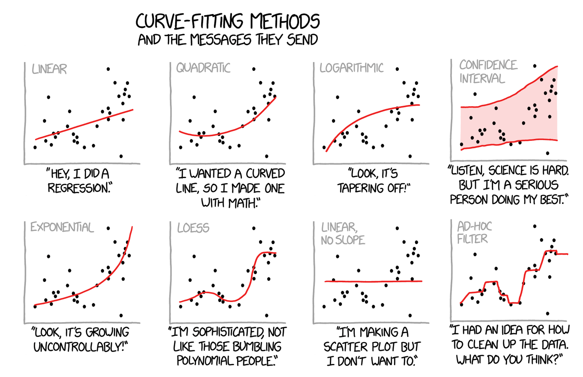
It made me recall a remarkable-looking paper from a couple of years ago, which drew some interest:
Chatterjee's correlation coefficient for 1D RVs https://t.co/KKTVggNwja behaves nicely and has wonderful relationships to copula measures, HSIC, etc
— Akshay Balsubramani ((_bakshay?)) December 22, 2021
The coefficient I mention takes a shot at this problem from a fundamental perspective. It was proposed in 2019 by (Chatterjee 2021), and is one of the niftiest recent bits of statistics I’ve seen. It looked remarkably simple, and I thought I’d try it out!
The coefficient given by (Chatterjee 2021) uses the coordinates \((x_1, y_1), \dots, (x_n, y_n)\) of the \(n\) points comprising the scatterplot. It calculates a simple statistic \(\xi_n\). First, the points are sorted so that \(x_1 \leq x_2 \leq \dots \leq x_n\); then, let \(r_i\) be the rank of \(y_i\), i.e. the number of \(j\) such that \(y_j \leq y_i\). Then \[ \xi_n = 1 - \frac{3}{n^2 - 1} \sum_{i=1}^{n-1} | r_{i+1} - r_{i} | \]
To heavily quote the paper (Chatterjee 2021), the statistic has several advantages:
It can be even be used for hypothesis testing, to test independence between the variables.
Here’s a beautiful visualization of some of the behavior of Chatterjee’s coefficient, compared to Pearson’s coefficient measuring linear correlation.
The coefficient’s behavior can be nicely illustrated by looking at some examples, comparing it to a couple of other coefficients of correlation.
Let’s look at a classic set of four scatter plots, Anscombe’s quartet, which are designed to have the same Pearson’s \(r\) despite having very different characteristics of association.
The rank-based Spearman correlation and the Chatterjee coefficient do discriminate between these datasets, in different ways. The Chatterjee coefficient is relatively high for the nonlinearly associated dataset II, compared to the noisier but more linear association in I; the opposite is true of the Spearman correlation.
x = [10, 8, 13, 9, 11, 14, 6, 4, 12, 7, 5]
y1 = [8.04, 6.95, 7.58, 8.81, 8.33, 9.96, 7.24, 4.26, 10.84, 4.82, 5.68]
y2 = [9.14, 8.14, 8.74, 8.77, 9.26, 8.10, 6.13, 3.10, 9.13, 7.26, 4.74]
y3 = [7.46, 6.77, 12.74, 7.11, 7.81, 8.84, 6.08, 5.39, 8.15, 6.42, 5.73]
x4 = [8, 8, 8, 8, 8, 8, 8, 19, 8, 8, 8]
y4 = [6.58, 5.76, 7.71, 8.84, 8.47, 7.04, 5.25, 12.50, 5.56, 7.91, 6.89]

anscombe_quartet = {
    'I': (x, y1),
    'II': (x, y2),
    'III': (x, y3),
    'IV': (x4, y4)
}

import matplotlib.pyplot as plt

fig, axs = plt.subplots(1, 4, sharex=True, sharey=True, figsize=(15,5))

lst = []
for k in anscombe_quartet:
    x, y = anscombe_quartet[k]
    lst.append((x, y))

for i in range(len(lst)):
    x = np.array(lst[i][0])
    y = np.array(lst[i][1])
    axs[i].scatter(x, y)
    title_str = list(anscombe_quartet.keys())[i]
    chat_coef = round(Chat19_coef_1(x, y), 3)
    spearman_coef = round(scipy.stats.spearmanr(x, y)[0], 3)
    corr_coef = round(scipy.stats.pearsonr(x, y)[0], 3)
    axs[i].title.set_text(f'{title_str} \n Pearson: {corr_coef} \n Spearman: {spearman_coef} \n Chatterjee: {chat_coef}')

plt.show()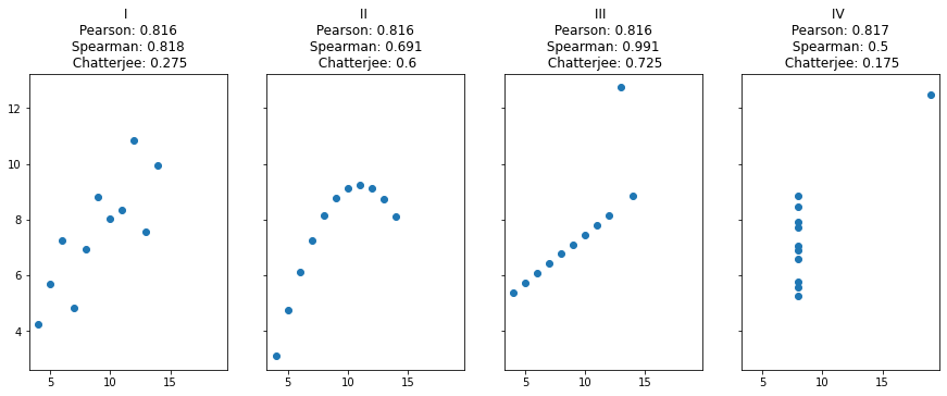
One of the most practical uses of the coefficient \(\xi_n\) is to detect oscillatory signals, a task for which it is very well-suited. The absolute differences of the ranks turn out to be very good at emphasizing deviations from zero, when compared to e.g. their linear (Spearman) correlation. And if \(\xi_n\) is thresholded and treated as a hypothesis test, this resulting test has empirically superior power to detect oscillatory signals, even when they are noisy.
This can be illustrated with a simple simulation, adding noise to an oscillatory signal.
def sim_oscillatory_noise(
    num_points = 1000,
    noise_weight = 1.0,
    freqs = [1],
    print_energy=False
):
    xs = (10./num_points)*np.arange(1, num_points)
    signal_components = [np.sin(f*xs) for f in freqs]
    signal = (1./np.sqrt(len(signal_components)))*np.sum(signal_components, axis=0)
    noise = noise_weight*np.random.randn(len(xs))
    ys = signal + noise
    if print_energy:
        print("Signal energy: {} \t Noise energy: {}".format(np.sum(np.square(signal)), np.sum(np.square(noise))))
    return xs, ys, signal

def viz_coeff_fit(xs, ys, signal, plot_signal=False, size=2):
    plt.scatter(xs, ys, s=size)
    if plot_signal:
        plt.plot(xs, signal, color='orange')
    chat_coef = round(Chat19_coef_1(xs, ys), 3)
    spearman_coef = round(scipy.stats.spearmanr(xs, ys)[0], 3)
    corr_coef = round(scipy.stats.pearsonr(xs, ys)[0], 3)
    plt.title(f'Pearson: {corr_coef} \n Spearman: {spearman_coef} \n Chatterjee: {chat_coef}')
    plt.show()

xs, ys, signal = sim_oscillatory_noise(num_points = 1000, noise_weight = 0.0, freqs = [3, 1])
viz_coeff_fit(xs, ys, signal, plot_signal=False)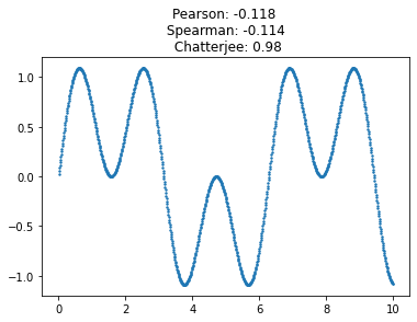
This new coefficient is remarkably tolerant of noise, and of high-frequency components in the signal. Its sensitivity (power) allows it to perform very well at detecting complex signals buried among noise. Here is the same signal with a lot of noise added; Chatterjee’s coefficient is still quite distinct from zero.
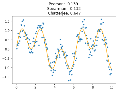
Even complex signals with high-frequency components are well-detected, better than with the naked eye.
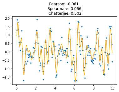
It’s very clear that this coefficient is not symmetric; it is hopeless to predict \(x\) from \(y\), because most \(y\)-values map to multiple \(x\)-values.
So \(x\) and \(y\) cannot be interchanged here, unlike with Pearson/Spearman-like alternatives - this measures how well \(y\) can be predicted from \(x\).
When \(X\) and \(Y\) are independent, \(\xi (X, Y)\) is zero, meaning that \(\xi_n \to 0\) for large \(n\). Furthermore, the distribution of \(\xi_n\) is well-characterized: \(\sqrt{\frac{5}{2} n} \xi_n\) follows a standard normal distribution.
(See Sec. 4.2 of (Chatterjee 2021) for details.)
To test this with the above scatterplots, we can shuffle the x-y mapping to draw independent samples from the \(x\)-marginal and the \(y\)-marginal. I simulated this by drawing repeated bootstrap samples from the \(x\)- and \(y\)-vectors. Below, we see excellent agreement with the theory.
def samp_bivariate_normal(num_samps, sigma_1=1, sigma_2=2, pearson_corr=0.0):
    """Draw a bivariate normal with a given mean and covariance matrix."""
    mean = np.zeros(2)
    off_covar = pearson_corr*sigma_1*sigma_2
    covmat = np.array([[sigma_1*sigma_1, off_covar], [off_covar, sigma_2*sigma_2]])
    randsamps = np.random.multivariate_normal(mean, covmat, size=num_samps)
    return randsamps

def datagen_bivariate(num_samps):
return samp_bivariate_normal(num_samps, pearson_corr=0.3)import statsmodels.api as sm
def samp_indep_marginals(num_samps, xdist, ydist):
"""Draw independent bootstrap samples from vectors xdist and ydist."""
return np.stack([np.random.choice(xs, num_samps, replace=True), np.random.choice(ys, num_samps, replace=True)]).T
def datagen_indep_bootstrap(xs, ys):
return lambda num_samps: samp_indep_marginals(num_samps, xs, ys)
def monte_carlo_Chat19_coef1D(
fn_datagen,
num_trials=10000, num_samps=300
):
sim_coeffs = []
for t in range(num_trials):
biv = fn_datagen(num_samps)
sim_coeffs.append(Chat19_coef_1(biv[:, 0], biv[:, 1]))
sim_coeffs = np.sqrt(num_samps)*np.array(sim_coeffs)/np.sqrt(0.4)
return sim_coeffs
fig, axs = plt.subplots(1, 2, sharex=False, sharey=False, figsize=(12,5))
sim_coeffs = monte_carlo_Chat19_coef1D(datagen_indep_bootstrap(xs, ys))
axs[0].hist(sim_coeffs, bins=150, density=True)
x_axis = np.arange(-4,4,0.05)
axs[0].plot(x_axis, scipy.stats.norm.pdf(x_axis, 0, 1))
axs[0].set_yticks([])
sm.qqplot(sim_coeffs, line='45', ax=axs[1])#, s=6)
plt.show()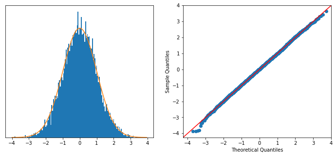
In the units of \(\xi_n \in [0,1]\), this is equivalent to a standard deviation of \(\sqrt{\frac{2}{5n}} = 0.02\).
Since this coefficient is so good at detecting all sorts of different patterns, I wanted to try it on some biological (single-cell) data, for which coefficients of various kinds are commonly used on many thousands of covariates at once.
Here we load some already-processed data from pancreatic endocrine cells. Each sample is a cell, with selected genes’ expression measured, and each cell has a calculated “time”-like value associated with its identity within endocrine development.
To try out the coefficient, we calculate the ability of this time value to predict the expression of each gene in turn.
import scanpy as sc, time
sc._settings.settings.verbosity = 0     # disable warning messages

import sklearn.preprocessing

itime = time.time()
fname = "endocrinogenesis_day15.5_preprocessed.h5ad"
#fname = "waddington-OT.h5"

# import gdown
# file_id = 'https://drive.google.com/file/d/1eB8RF96hYLs_VkywWlBiTCiLEWP0E8aN/view?usp=sharing'.split('/')[-2]
# gdown.download(url='https://drive.google.com/uc?id={}'.format(file_id), output=fname, quiet=False)
adta = sc.read(fname)
print('Data read. Time: {}'.format(time.time() - itime))
Data read. Time: 1.4025239944458008In order to smooth out the effects of sparsity in the data and clarify the results, we can use the nearest-neighbor graph already calculated over the data, by averaging each gene’s expression for each cell over its few neighboring cells. This is nonparametric and can be thought of as making relatively minimal modeling assumptions, and we’d expect to avoid systematically affecting the types of patterns we detect.
def smooth_anndata(adta, as_nonsparse=True, degree=2):
    w = adta.obsp['connectivities']
    w_norm = sklearn.preprocessing.normalize(w, norm='l1', axis=1)
    if degree==0:
        X_smooth = adta.X
    elif degree==1:
        X_smooth = w_norm.dot(adta.X)
    else:
        adjmat = w_norm
        for i in range(degree-1):
            adjmat = adjmat.dot(w_norm)
        X_smooth = adjmat.dot(adta.X)
    adta_smooth = adta.copy()
    if as_nonsparse:
        adta_smooth.X = X_smooth.toarray()
    return adta_smooth

data_smoothed = smooth_anndata(adta, degree=2)

ptime = np.array(data_smoothed.obs['dpt_pseudotime'])
# ptime = np.array(data_smoothed.obs['day'], dtype=float)

itime = time.time()
#ptime = scipy.stats.rankdata(ptime)   # Doesn't change anything about the calculated coefficient.
chat_coeffs_all = []
spearman_coeffs_all = []
gene_names_all = []
for gene_ndx in range(data_smoothed.shape[1]):
    chat_coeffval = Chat19_coef_1(ptime, data_smoothed.X[:, gene_ndx])
    spearman_coeffval = scipy.stats.spearmanr(ptime, data_smoothed.X[:, gene_ndx])[0]
    gene_names_all.append(data_smoothed.var.index[gene_ndx])
    #ret[gene_name] = coeffval
    chat_coeffs_all.append(chat_coeffval)
    spearman_coeffs_all.append(spearman_coeffval)
print('Coefficients computed. Time: {}'.format(time.time() - itime))
coeffs_all = np.stack([spearman_coeffs_all, chat_coeffs_all])
Coefficients computed. Time: 2.2430570125579834We can plot the Spearman and Chatterjee correlations against each other to gain some more insight into how they vary.
#fig, axs = plt.subplots(1, 2, sharex=False, sharey=False, figsize=(15,5))

plt.scatter(coeffs_all[0, :], coeffs_all[1, :], s=3)
envelope_absc = np.arange(-1,1,0.01)
envelope_ordi = np.abs(np.power(0.8*envelope_absc, 2))
plt.plot(envelope_absc, envelope_ordi, color='orange')
plt.xlabel('Spearman correlation')
plt.ylabel('Chatterjee correlation')

plt.show()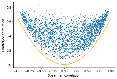
We can see that there are no genes at all below the orange line drawn. In other words, there are essentially no genes highlighted by Spearman’s coefficient but not Chatterjee’s.
Interestingly, the converse isn’t true - many genes that are associated by Chatterjee’s coefficient aren’t associated by Spearman’s. Let’s zoom in to that region of the above plot.
ndxs = []
for i in range(len(chat_coeffs_all)):
    if ((chat_coeffs_all[i] > 0.5) and (np.abs(spearman_coeffs_all[i]) < 0.3)):
        ndxs.append(i)

plt.scatter(coeffs_all[0, :][ndxs], coeffs_all[1, :][ndxs], s=3)
plt.xlabel('Spearman correlation')
plt.ylabel('Chatterjee correlation')
for i in ndxs:
    plt.annotate(gene_names_all[i], (spearman_coeffs_all[i], chat_coeffs_all[i]))

plt.show()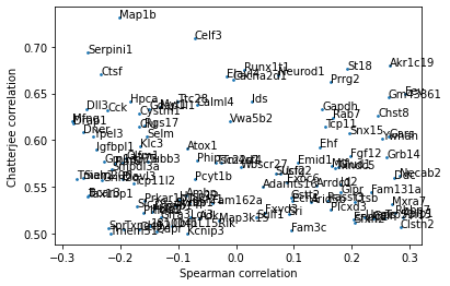
Plotting these genes reveals a common oscillatory pattern among them, again showing the relative power of the new coefficient in detecting such patterns, which Spearman’s correlation does not pick up.
gnames_subset = [gene_names_all[i] for i in ndxs]
chatcoefs_subset = [chat_coeffs_all[i] for i in ndxs]
spearcoefs_subset = [spearman_coeffs_all[i] for i in ndxs]
top_genes = np.array(gnames_subset)[np.argsort(chatcoefs_subset)[::-1]]

fig, axs = plt.subplots(5, 10, sharex=True, sharey=False, figsize=(22,12))

for i in range(50):
    gname = top_genes[i]
    y = np.ravel(np.array(data_smoothed[:, gname].X))
    axs[i%5][i//5].scatter(ptime, y, s=2)
    axs[i%5][i//5].title.set_text(f'Gene: {gname}')
    axs[i%5][i//5].set_yticks([])
    #print(gname, scipy.stats.spearmanr(ptime, y)[0], Chat19_coef(ptime, y))

fig.suptitle("Top 50 genes with high Chatterjee, low Spearman correlation")
plt.show()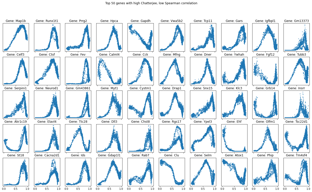
The basic version took just a few lines of code! This coefficient measures statistical (nonlinear) dependence in a wonderfully practical, interpretable way. And there’s a lot more to this line of work, including coefficients for multivariate and conditional dependence, and more statistical power Shi, Drton, and Han (2022). 🥳
Since I found no transparent Python implementations for these, I implemented them to understand them better.
Since we are measuring how well a variable \(X\) can predict \(Y\), the common and useful case is when \(X\) is a multivariate vector, in which case the dependency \(X \to Y\) cannot be plotted on a scatterplot, as we initially started with.
The paper (Azadkia and Chatterjee 2021) introduces a wonderful extension of the coefficient to this case, structured around a key creative observation.
The \(X\)’s ranks can be interpreted as nearest-neighbor relationships in one dimension.
Using this observation, (Azadkia and Chatterjee 2021) define a ingenious statistic using multivariate \(X\). This statistic also introduces a way to incorporate prior knowledge about the predictability of \(Y\), by conditioning on another multivariate variable \(Z\).
The generalized statistic computes differences in \(Y\), compares nearest neighbors (NNs) of the \(X\) values, and incorporates any given conditioning variable \(Z\) into neighborhood comparisons. Details and code are below.
The statistic compares the nearest neighborhoods of points in \(Z\) with points in \((Z, X)\) (i.e., without and with conditioning on \(X\)).
For each \(i\), Let \(N(i)\) be the index \(j\) such that \(Z_j\) is the NN of \(Z_i\). Let \(M(i)\) be the index \(j\) such that \(( Z_j , X_j )\) is the NN of \(( Z_i, X_i )\). Let \(R_i\) be the rank of \(Y_i\).
Then \[ T_n (X, Y \mid Z) := \frac{ \sum_{i=1}^{n} \left( \min( R_i , R_{M(i)} ) - \min( R_i , R_{N(i)} ) \right) }{ \sum_{i=1}^{n} \left( R_i - \min( R_i , R_{N(i)} ) \right) } \qquad \stackrel{n \to \infty}{\to} \qquad \xi (X, Y \mid Z) \]
from sklearn.neighbors import NearestNeighbors

def AC21_coef(xs, ys, cond_covariates=None):
    """
    Multivariate version of the dependence coefficient. From Azadkia & Chatterjee, 2021.
    xs: (n x d1) array of "independent variable" covariates, where n is the number of samples.
    ys: n-dimensional vector of "dependent variable" covariate values.
    cond_covariates: (n x d2) array of "conditional" covariates, where n is the number of samples.
    """
    ranks = scipy.stats.rankdata(ys, method='max')
    n = len(ys)
    if cond_covariates is not None:
        #print(cond_covariates.shape)
        if len(xs.shape) == 1:
            xs = np.reshape(xs, (-1, 1))
        #print(cond_covariates.shape)
        joint_data = np.hstack((xs, cond_covariates))
        distances_cond, indices_cond = NearestNeighbors(n_neighbors=2).fit(cond_covariates).kneighbors(cond_covariates)
        distances_joint, indices_joint = NearestNeighbors(n_neighbors=2).fit(joint_data).kneighbors(joint_data)
        cond_ranks = np.minimum(ranks[indices_cond[:, 1]], ranks)
        joint_ranks = np.minimum(ranks[indices_joint[:, 1]], ranks)
        denominator = (1.0/n)*np.mean(ranks - cond_ranks)
        if denominator == 0:
            return None
        numerator = (1.0/n)*np.mean(joint_ranks - cond_ranks)
        return numerator/denominator
    else:
        xs = xs.reshape(-1, 1)
        complement_ranks = scipy.stats.rankdata( -ys, method='max')
        distances_data, indices_data = NearestNeighbors(n_neighbors=2).fit(xs).kneighbors(xs)
        data_ranks = np.minimum(ranks[indices_data[:, 1]], ranks)
        numerators = n*data_ranks - np.square(complement_ranks)
        numer = (1.0/(n*n))*np.mean(numerators)
        denominators = np.multiply(complement_ranks, n - complement_ranks)
        denom = (1.0/(n*n))*np.mean(denominators)
        return numer/denom
This is not identical to the single-variable coefficient \(\xi_n\), but it is not far from it. It gives almost the same results as the previous coefficient when the conditional covariates \(Z\) are omitted.
xs = 0.1*np.arange(1, 100)
ys = np.sin(xs) + 0.3*np.random.randn(len(xs))

xs, ys, signal = sim_oscillatory_noise(num_points = 2000, noise_weight = 0.3, freqs = [7, 15, 6, 4, 13])

plt.scatter(xs, ys, s=1.4)
chat_coef = round(Chat19_coef(xs, ys), 3)
ac21_coef = round(AC21_coef(xs, ys), 3)
spearman_coef = round(scipy.stats.spearmanr(xs, ys)[0], 3)
corr_coef = round(scipy.stats.pearsonr(xs, ys)[0], 3)
plt.title(f'Pearson: {corr_coef} \n Spearman: {spearman_coef} \n Chatterjee: {chat_coef} \n AC21: {ac21_coef}')
plt.show()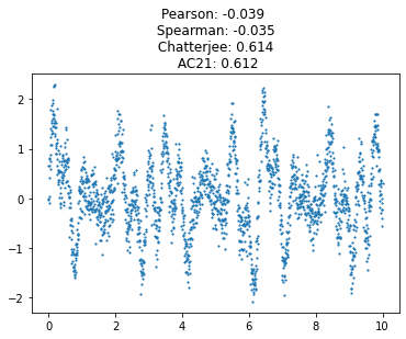
The ability to condition on \(Z\) allows us to do greedy “forward” feature selection for trying to predict a signal \(Y\) from \(X_1, X_2, \dots, X_d\), introduced in (Azadkia and Chatterjee 2021). To sketch it out:
The code for this is below. The scalability largely depends on the number of features \(d\), because \(T_n\) is recomputed O(\(d^2\)) times. Though it’s possible to refactor the code to somewhat reduce the computation, a data-driven way to do it is to add multiple features at once using a precomputed clustering of the features. I don’t explore that in this post.
def feat_selection(signal, featmat, num_features=10):
    itime = time.time()
    selected_feats = []
    selected_featmat = None
    unselected_feats = list(range(featmat.shape[1]))
    while len(selected_feats) < num_features:
        max_var_explained = 0
        feat_to_add = 0
        for feat_ndx in unselected_feats:
            feat_arr = featmat[:, feat_ndx]
            feat_coeff = AC21_coef(feat_arr, signal, cond_covariates=selected_featmat)
            # Add to $S$ whichever feature $X_m \in U$ maximizes $T_n (X_m , Y \mid S)$.
            if feat_coeff > max_var_explained:
                feat_to_add = feat_ndx
                max_var_explained = feat_coeff
                print(feat_ndx, feat_coeff)
        unselected_feats.remove(feat_to_add)
        selected_feats.append(feat_to_add)
        selected_featmat = featmat[:, selected_feats]
        print(selected_feats, time.time() - itime)
    return selected_feats

signal = data_smoothed.obs['dpt_pseudotime']
featmat = data_smoothed.X
feat_selection(signal, featmat)The original paper (Chatterjee 2021) benchmarked the Chatterjee coefficient against other general measures of dependence between random variables, like distance covariance and the Hilbert-Schmidt Independence Criterion. The statistical relationships between these coefficients are still being understood (see (Han 2021)). They’re empirically broadly competitive in statistical performance, though the Chatterjee coefficient is orders of magnitude faster in practice.
However, (Shi, Drton, and Han 2022) found that the power of Chatterjee’s correlation coefficient is worse than for other rank coefficients in some prototypical situations in the large-\(n\) regime. To correct this and boost the power, (Lin and Han 2023) generalized the statistic for scalar random variables.
The generalized coefficient uses many nearest neighbors rather than just the single nearest neighbor, so it has a parameter num_nbrs, which governs the number of NNs used. - num_nbrs = 1 gives the original Chatterjee coefficient. - num_nbrs ~ log(n) is recommended by the authors (Lin and Han 2023).
The code is again relatively short and explanatory of the formula. I implemented it below in an efficient manner that’s ready to use.
def LH21_coef(xs, ys, num_nbrs=1):
    """
    Modified univariate version of the dependence coefficient. From Lin & Han, 2021.
    xs: n-dimensional vector of "independent variable" covariates, where n is the number of samples.
    ys: n-dimensional vector of "dependent variable" covariate values.
    num_nbrs: number of (right) nearest neighbors to use. An integer >= 1.
    """
    ranks = scipy.stats.rankdata(ys, method='max')
    n = len(ys)
    jmi_arrs = []
    for k in range(1, num_nbrs+1):
        x_ndces = list(np.argsort(xs))
        a_arr = x_ndces.copy()
        x_ndces[:-k] = x_ndces[k:]
        b_arr = x_ndces
        jmi_arrs.append( np.array(b_arr)[np.argsort(a_arr)] )
    jmi_arrs = np.stack(jmi_arrs)
    ctrl_indices = np.tile(np.arange(len(ranks)), (jmi_arrs.shape[0], 1))
    summed_rank_vars = np.minimum(ranks[ctrl_indices], ranks[jmi_arrs]).sum()
    denom = (n+1)*((n*num_nbrs) + (num_nbrs*(num_nbrs+1)/4))
    return (6*summed_rank_vars/denom) - 2

fig, axs = plt.subplots(1, 2, sharex=False, sharey=False, figsize=(12,3))

xs, ys = ptime, np.ravel(data_smoothed[:, 'Gapdh'].X)
axs[0].scatter(xs, ys, s=1.4)
chat_coef = round(Chat19_coef_1(xs, ys), 3)
ac21_coef = round(AC21_coef(xs, ys), 3)
lh21_coef = round(LH21_coef(xs, ys, num_nbrs=1), 3)
spearman_coef = round(scipy.stats.spearmanr(xs, ys)[0], 3)
corr_coef = round(scipy.stats.pearsonr(xs, ys)[0], 3)
axs[0].set_title(f'Pearson: {corr_coef} \n Spearman: {spearman_coef} \n Chatterjee: {chat_coef} \n AC21: {ac21_coef} \n LH21 (num_nbrs=1): {lh21_coef}')

to_plot = []
absc = np.power(1.6, np.arange(1, 15)).astype(int)
for i in absc:
    #print(LH21_coef(xs, ys, num_nbrs=i))
    to_plot.append(LH21_coef(xs, ys, num_nbrs=i))

axs[1].set_title(f'LH21 Coefficient with increasing num_nbrs')
axs[1].set_xlabel(f'num_nbrs')
axs[1].plot(absc, to_plot)
plt.show()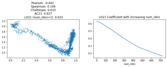
Increasing num_nbrs tends to lower the coefficient’s value (as seen in the right plot above), but has been demonstrated to benefit the power overall in some simple situations.
The original coefficient from (Chatterjee 2021) always converges to a certain measure of dependence between the random variables \(X\) and \(Y\): \[ \xi (X, Y) = \frac{ \mathbb{E}_{u \sim Y} (\text{Var} ( \mathbb{Pr} (Y \geq u | X) ) }{ \mathbb{E}_{u \sim Y} (\text{Var} (\textbf{1}_{Y \geq u} )) } \]
This has a nice interpretation: it generalizes the linear Pearson coefficient \(r^2\) – the proportion of the variance of \(Y\) explained by \(X\) – to detect nonlinear relationships.
For any threshold \(u\), define the indicator random variable \(\textbf{1}_{Y \geq u}\), which is 1 iff \(Y \geq u\). The variance of this random variable can be broken into parts (by the law of total variance): \[ \underbrace{\text{Var} (\textbf{1}_{Y \geq u} )}_{\text{total variance}} = \underbrace{\text{Var} ( \mathbb{E}(\textbf{1}_{Y \geq u} | X))}_{\text{explained by $X$}} + \underbrace{\mathbb{E}( \text{Var} (\textbf{1}_{Y \geq u} | X))}_{\text{not explained by $X$}} \] The fraction of the total variance of \(\textbf{1}_{Y \geq u}\) that’s explained by \(X\) is the squared Pearson’s correlation \(r^2_{Y | X} = \frac{ \text{Var} ( \mathbb{E}(\textbf{1}_{Y \geq u} | X)) }{ \text{Var} (\textbf{1}_{Y \geq u} ) }\). Using this, it’s easy to show that if \(Y\) is a binary \(\{0, 1\}\) variable, Chatterjee’s new coefficient \(\xi (X, Y)\) is exactly \(r^2_{Y | X}\).
For non-binary \(Y\), we can always write \(Y\) as a weighted average of binary variables \(Y_t := \textbf{1}_{Y \geq t}\), because \(Y = \mathbb{E}_{t \sim Y} ( Y_t )\). In this case, \(\xi (X, Y)\) therefore turns out to be a weighted average of correlations \(r^2_{ Y_t | X}\), with the weights for different \(t\) depending on the distribution of \(Y\) (see {% cite azadkia2021simple %}, Sec. 3 for details).
The extended dependence coefficient from (Azadkia and Chatterjee 2021) converges to another measure of conditional dependence between random variables \(X\) and \(Y\) given a random variable \(Z\): \[ \xi (X, Y \mid Z) = \frac{ \mathbb{E}_{u \sim Y} (\text{Var} ( \mathbb{Pr} (Y \geq u | X, Z ) \mid Z) }{ \mathbb{E}_{u \sim Y} (\text{Var} (\textbf{1}_{Y \geq u} \mid Z )) } \]
Like the unconditioned measure \(\xi\), this isolates the explanatory power of \(X\) on \(Y\). Here, however, the conditional variance (given \(Z\)) is used instead of the variance.
Sensitivity analysis decomposes the variance into components attributable to features. The measure \(\xi (X, Y)\) even has a general interpretation in terms of copulas (Dette, Siburg, and Stoimenov 2013).
scipy.stats.rankdata function. I used the bottleneck package to replace this with the bottleneck.rankdata function, which gave around a ~30% speedup in my hands.#collapse-hide
# Version of the univariate Chatterjee coefficient with ties allowed.
def Chat19_coef(xs, ys):
ranks = scipy.stats.rankdata(ys[np.argsort(xs)])
sumdiff = np.sum(np.abs(np.diff(ranks)))
lks = len(ranks) + 1 - ranks
denom = np.mean(np.multiply(len(ranks)-lks, lks))
ret = 1 - (sumdiff/(2*denom))
return ret