A recurring theme in data‑driven projects is that good color choices matter. Choices made when mapping data to color can strongly influence the conclusions an audience draws: a poorly chosen colormap can hide important structure, give undue prominence to unremarkable features or even mislead viewers. In other posts, I use some hard-won knowledge about colormaps to create a lightweight interactive browser for exploring chemical space.
In this post, I go into more detail on some tasty tacit tidbits that are used in that and many other projects and papers.
Discrete colormaps
Colors often represent categorical variables. In such cases, for the majority of people who share a perceptual understanding of color space, it pays to always have colors that look as distinct as possible. (Of course, this is all quite subjective because perceptions of color are in the eye of the beholder; but we aim to produce the maximum effect for a broad audience’s aesthetic sense. )
There are various ways of ensuring this in different color spaces. There is no one-size-fits-all solution to, for instance, complete a circuit in some continuous latent color space and have this map to maximally distinct looking colors.
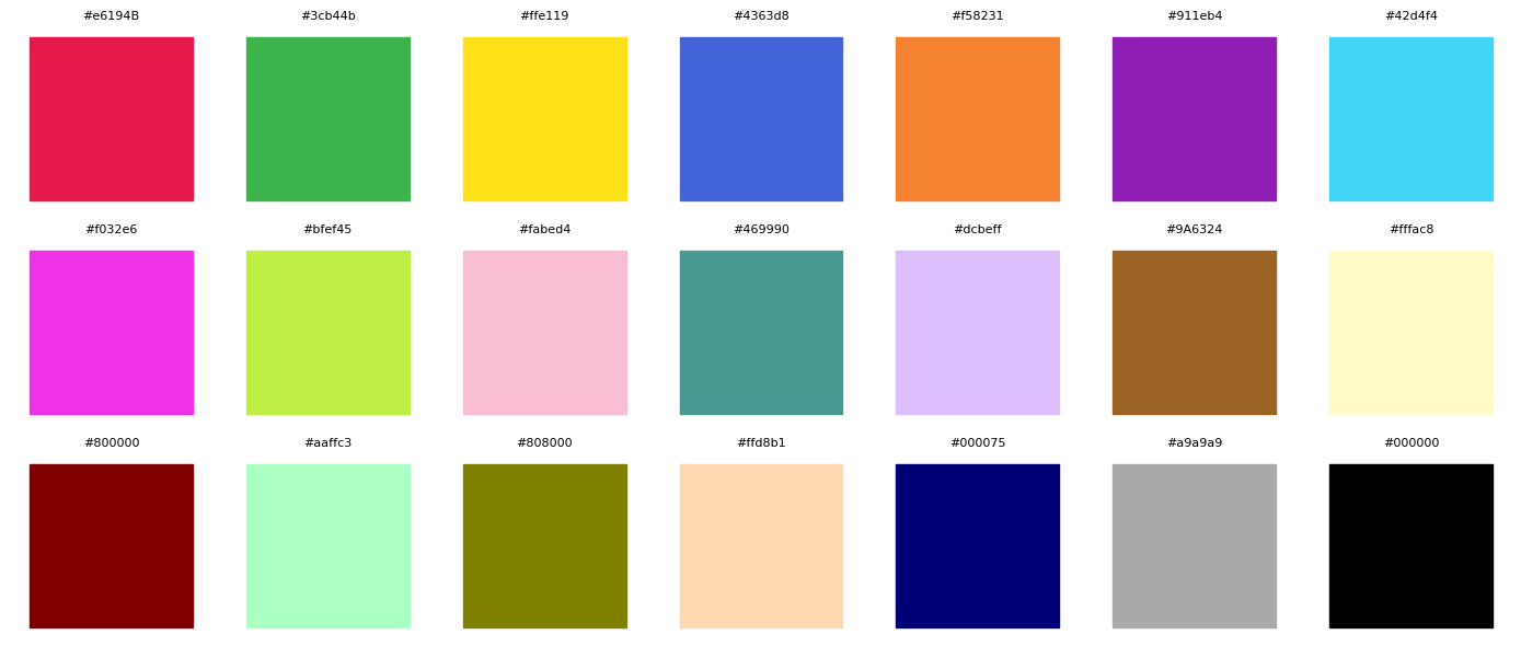
In pursuit of such a solution, there are many striking color maps which have been painstakingly devised using large numbers of colors for large numbers of categories. Single-cell analysis abounds with such color maps. Here are a few particularly useful and striking ones.
CODE
import matplotlib.pyplot as plt, matplotlib.colorsimport numpy as npimport seaborn as sns# Visualize a list of colors in a pleasing waydef visualize_discrete_colors(colors, ncols=10):""" Display a list of colors in a grid layout. Args: colors: List of color strings (hex codes or named colors) ncols: Number of columns in the grid (default 10) """# Calculate number of rows needed ncolors =len(colors) nrows =int(np.ceil(ncolors / ncols)) plt.figure(figsize=(2*ncols, 2*nrows))# Plot each color as a filled rectanglefor idx, color inenumerate(colors): row = idx // ncols col = idx % ncols plt.subplot(nrows, ncols, idx +1) plt.fill([0, 1, 1, 0], [0, 0, 1, 1], color=color) plt.axis('equal') plt.axis('off') plt.title(color, fontsize=8) plt.tight_layout() plt.show()
There are also more interactive ways of choosing discrete colormaps for any situation.
ColorBrewer is a pioneering and still great-looking tool for visualizing small colormaps.
iwanthue and other tools are web-based tools for choosing discrete colormaps, which try to keep colors as distinct as possible.
When choosing a discrete palette, consider both the number of categories you need and the perceptual distinctness of each color. Categorical palettes should have high contrast between adjacent hues; using more than 12–20 categories will inevitably reduce this contrast unless colors are repeated. Tools like ColorBrewer and iwanthue not only space hues evenly around the color wheel but also try to balance chroma and luminance so that colors remain distinct for viewers with common forms of color‑blindness.
Continuous colormaps
There are a couple of different kinds of continuous color maps, and it is essential to use the correct one for the correct type of data.
Perceptually uniform colormaps
Perceptually uniform color maps tend to work best with quantile normalization or percentile normalization. This is natural because the two distributions of the data and of perceptual space are being aligned. This point bears reemphasizing.
More generally, a perceptually uniform colormap is one where equal steps in the data correspond to equal perceptual differences on screen. Human observers perceive changes in lightness more readily than changes in hue, so perceptually uniform colormaps vary monotonically in lightness while gently modulating hue and saturation. Traditional colormaps like jet or rainbow vary wildly in both lightness and hue; they introduce artificial “hot spots” in the middle of the scale and can hide structure. Scientists therefore advocate using colormaps such as viridis, plasma, inferno and cividis, which were explicitly designed to be perceptually uniform and color‑blind friendly, and remain smooth when converted to grayscale.
Diverging and sequential colormaps
Sequential and diverging color maps are well known to apply to different types of continuous data. Data also need to be appropriately normalized before being passed into such color maps, which is a separate discussion.
But diverging colormaps in particular often look unsightly and hide certain dynamic ranges of the data within perceptual line spots. So a few favorite diverging colormaps which are old standbys are available here, designed with the middle color being black (i.e. for black backgrounds).
Sequential colormaps vary from a low to a high lightness -— often using one hue —- so they are ideal for ordered data with a natural zero and no meaningful sign. Diverging colormaps vary from one hue through a neutral midpoint to a contrasting hue, highlighting deviations around a central value, and should be used when positive and negative deviations are equally interesting. For periodic or cyclic data (e.g., wind direction or angles), cyclic colormaps that wrap around seamlessly are necessary. Regardless of the type, the lightness profile should be monotonic to avoid perceptual “flat spots” where data variations are hidden.
import matplotlib.colors# Define colormaps and their namescmaps_and_names = [ (matplotlib.colors.LinearSegmentedColormap.from_list("parula", cmap_parula), "Parula"), (matplotlib.colors.LinearSegmentedColormap.from_list("custom_rdbu", cmap_custom_rdbu_diverging), "Custom Red-Blue"), (matplotlib.colors.LinearSegmentedColormap.from_list("custom_ylbu", cmap_custom_ylbu_diverging), "Custom Yellow-Blue"), (matplotlib.colors.LinearSegmentedColormap.from_list("custom_orpu", cmap_custom_orpu_diverging), "Custom Orange-Purple"), (plt.cm.viridis, "Viridis")]def visualize_continuous_colors(cmaps_and_names):# Create figure with subplots stacked vertically fig, axes = plt.subplots(5, 1, figsize=(12, 8)) fig.subplots_adjust(hspace=0) gradient = np.linspace(0, 1, 256) gradient = np.vstack((gradient, gradient))# Plot each colormapfor ax, (cmap, name) inzip(axes, cmaps_and_names): ax.imshow(gradient, aspect='auto', cmap=cmap) ax.set_xticks([]) ax.set_yticks([])# Add text label in the middle of each colormap ax.text(0.02, 0.5, name, transform=ax.transAxes, verticalalignment='center', color='white', fontsize=10, fontweight='bold') plt.show()visualize_continuous_colors(cmaps_and_names)
The Parula colormap was popularized by MATLAB and is a well‑behaved sequential palette with smoothly increasing lightness. The custom red–blue and yellow–blue colormaps above are examples of diverging palettes designed to work on dark backgrounds; notice how both ends of the scale are bright and the middle is darker to provide contrast. Viridis is a perceptually uniform sequential colormap available in Matplotlib and many other libraries; it was designed to be readable by people with color‑vision deficiency and has become the default in several packages.
When designing a continuous colormap, we typically pick anchor colors (e.g., the minimum, midpoint and maximum) in a uniform color space such as CIELAB or HCL and interpolate smoothly between them. Tools like the vis4.net Chroma.js colormap generator provide an interactive interface for building such palettes.
Choosing a continuous colormap Apart from abstract color theory considerations (which are discussed elsewhere in this post), a fantastic interactive webtool for choosing a continuous colormap is given here by the Chroma.js framework. It includes all the necessities in choosing a sequential or diverging colormap for a web application, including all sorts of export formats to make colormaps like the above, from any number of anchor colors. There are even ways to easily visualize the impact of different types of color-blindness in audience members, which can otherwise make certain plots unreadable for some people.
So this tool is perfect to re-emphasize some salient points in choosing a continuous colormap:
Perceptually uniform sequential colormaps with monotonic lightness are often the safest choice because the human brain interprets changes in lightness as changes in value.
Diverging palettes should be symmetric around a neutral midpoint, and the neutral color should have intermediate lightness so that both extremes stand out equally, and should blend in with the background “paper” color for better aesthetics.
For cyclic data, ensure the colormap returns smoothly to its starting hue.
Testing a colormap under simulated color‑blindness (many tools offer this) and in grayscale; a map that fails under these conditions will likely mislead some viewers.
Colormaps from signals
There is an elegant and unified way to handle color-related code. The idea is to explicitly generate a list of colors, one per data point, and then use that list to color the data points. This simple approach is very useful for handling both discrete and continuous data, as we demonstrate here.
CODE
import numpy as np, scipy.statsimport matplotlib.colorsdef values_to_hex_colors( values, colormap=None):""" Convert a list of values to hex colors using either a continuous colormap or discrete color list. Parameters: ----------- values : list or array-like List of values to convert to colors colormap : list List of colors (discrete coloring) or list of (color, value) pairs (continuous coloring) Returns: -------- list List of hex color strings, one for each input value """ values = np.array(values) hex_colors = []if colormap isNoneornotisinstance(colormap, list):return []ifisinstance(colormap[0], str):# Discrete coloring unique_vals = np.unique(values)iflen(unique_vals) >len(colormap):raiseValueError(f"Number of unique values ({len(unique_vals)}) exceeds number of colors ({len(colormap)})")# Create mapping from values to color indices val_to_idx = {val: idx for idx, val inenumerate(unique_vals)}for val in values: color = colormap[val_to_idx[val]]# Convert color to hex if it's not alreadyifnotisinstance(color, str) ornot color.startswith('#'): hex_color = matplotlib.colors.to_hex(color)else: hex_color = color hex_colors.append(hex_color)elifisinstance(colormap[0], tuple):# Continuous coloring; Normalize values to [0, 1] using rank q_values = scipy.stats.rankdata(values)/len(values) cmap = matplotlib.colors.LinearSegmentedColormap.from_list("custom_colormap", colormap) hex_colors = [matplotlib.colors.rgb2hex(cmap(val)) for val in q_values]return hex_colors
When using this helper for discrete data, ensure that the number of unique values does not exceed the palette length; otherwise the function raises an error. For continuous data, the function ranks values and feeds them through a continuous colormap. This effectively normalizes continuous data using quantiles before mapping to color, particularly helping when data are skewed; ranking achieves a similar effect by turning continuous values into percentiles.
Some practical color theory
Color wheel
So far we’ve focused on the technical aspects of colormaps. A brief detour into classical color theory can help when constructing one’s own palettes. The color wheel, invented by Isaac Newton, arranges hues around a circle; relationships between positions on the wheel give rise to the following common design patterns:
Complementary — Two colors on opposite sides of the color wheel. This combination provides high contrast and high impact, and the colors will appear brighter and more prominent when used together.
Monochromatic — Different tints, tones and shades of a single hue. This scheme is subtle and conservative; by varying lightness and saturation rather than hue it produces harmonious palettes.
Analogous — Three hues that are adjacent on the color wheel. Analogous schemes are versatile but can be overwhelming; a common strategy is to pick one dominant hue and use the others sparingly.
Triadic — Three hues evenly spaced around the wheel. Triadic schemes have high contrast but are more balanced than complementary pairs. The classic red–yellow–blue combination is triadic in the RYB model, and green–orange–purple is triadic in the RGB model.
Tetradic — Four hues forming a rectangle on the wheel. These schemes are bold and can be harder to balance; it helps to choose one hue as dominant and treat the others as accents.
The wheel also distinguishes primary, secondary and tertiary colors. In the additive RGB system, red, green and blue are primary; mixing primaries yields the secondary colors cyan, magenta and yellow; mixing a primary with a neighboring secondary yields six tertiary colors. Warm colors (reds, oranges and yellows) evoke energy and warmth, while cool colors (blues and greens) suggest calmness. These psychological associations can be useful when picking colors for presentations.
When adjusting a single hue, adding black creates a shade, adding white creates a tint, and adding grey creates a tone. Tints and tones can soften a palette and improve legibility. Many categorical palettes in software such as Matplotlib and ggplot2 are built by choosing hues spaced around the wheel and then modulating tints and tones to increase contrast.
Implementations
For many years, these ideas have been experimented with in a variety of settings. Chroma.js is just one example. This vis4 post is a fantastic resource explaining the reasoning behind the HCL space using the principles behind its antecedents. The knowledge there is completely relevant even today.
In practice, you rarely have to implement colormaps from scratch. The Python Matplotlib library registers dozens of built‑in colormaps and supports custom colormaps, as shown here. The Seaborn library builds on Matplotlib and includes categorical, sequential and diverging palettes, as used here for making discrete palettes. The Colorcet, Viridis, and cmocean packages provide collections of perceptually uniform color‑blind friendly colormaps in Python. In JavaScript, Chroma.js and d3‑scale‑chromatic offer similar capabilities.
Color spaces
HCL
HCL (Hue–Chroma–Luminance) is a cylindrical transformation of a uniform color space such as CIELAB or CIELUV. In HCL, hue corresponds to an angle around the circle, chroma to the distance from the grey axis (saturation), and luminance to the vertical lightness axis. Because it is derived from perceptually uniform spaces, equal distances in HCL correspond more closely to equal perceptual differences. Information‑visualization practitioners often adopt HCL to present data without the bias implicit in varying saturation. Constructing palettes in HCL is straightforward: you choose a luminance path (e.g., monotonic for sequential data), fix chroma values to control saturation, and sample hues evenly around the circle. The colorspace package in R and the scikit‑image library in Python provide HCL conversions.
HSV
HSV and its cousin HSL are simple cylindrical transformations of the RGB color space: they encode a color in terms of hue, saturation and value (or lightness). Because they transform RGB linearly, they are easy to compute and intuitive—changing the hue slider rotates around the color wheel. However, beware using them. HSV is not perceptually uniform: a dark blue and white may have the same value, and a vivid yellow and a mid‑green may share the same saturation. In HSV and HSL, saturation and lightness are confounded, meaning that changing one attribute inadvertently changes the others. Consequently, HSV is unsuitable for quantitative colormaps and should be reserved for user‑interface color pickers or situations where perceptual uniformity is not required.
LUV
The CIE 1976 L u v* color space (CIELUV) is a uniform color space adopted by the International Commission on Illumination in 1976. It is a simple transformation of the 1931 CIE XYZ color space that attempts perceptual uniformity and is widely used in applications dealing with colored lights. In CIELUV the lightness coordinate L* (0–100) is combined with chromaticity coordinates u* and v. Because the uv plane preserves additive mixing (straight lines correspond to mixing of lights), CIELUV is favoured in computer graphics and display calibration. LUV is also popular in information visualization because it provides stable saturation for self‑illuminated colors—television and monitor displays—and is often preferred over LAB for emissive media. A cylindrical transformation of CIELUV, sometimes called LCHuv, converts (u, v*) into polar coordinates (chroma and hue), allowing palettes to be specified in terms of lightness, chroma and hue.
Lab
CIELAB (L a b) is another uniform color space introduced at the same time as CIELUV. It encodes color using lightness L and two chromatic channels a* (red–green) and b* (yellow–blue). CIELAB is widely used to compute perceptual differences between reflective surface colors and is a standard intermediate space for color management in printing and imaging matplotlib.org . Like LUV, LAB is not perfectly uniform but is far more uniform than RGB or HSV. LAB‑based cylindrical spaces (commonly called LCHab) convert the a* and b* components into chroma and hue, which makes it easier to specify palettes with controlled lightness trajectories.
LCH
LCH (also written as LCh) refers to any of the cylindrical color spaces constructed from LAB or LUV by converting the two chromatic coordinates into polar form: L is lightness, C is chroma, and h is hue. The sRGB gamut plotted within the cylindrical CIELCH color spaces shows lightness on the vertical axis, chroma as the radius, and hue as the angle en.wikipedia.org . Because LCH inherits the perceptual uniformity of its parent space, it is increasingly used for accessible palette design; for example, CSS Color 4 introduces lch() and oklch() functions for web developers. By controlling lightness and chroma directly, you can construct palettes that vary smoothly in brightness while keeping saturation constant—ideal for sequential colormaps—and you can specify diverging palettes by mirroring chroma and hue around a central lightness.