CODE
import scanpy as sc

path_to_file = '../../files/omics/single_cell/GTEx_8_tissues_snRNAseq_atlas_071421.public_obs.h5ad'

adata = sc.read(path_to_file)
sc.pp.sample(adata, n=3000, rng=0)
df_to_visualize = adata.obsWe’ve often run into situations in small-molecule drug discovery in which chemists want to visualize a dataset of chemical structures. Often, this is in the context of some learned embedding space, and sometimes even in the context of a “QSAR” (Quantitative Structure-Activity Relationship) model which predicts the response of each structure in some context (e.g. its efficacy as a drug in vivo, or in an experimental validation platform). QSAR models can further isolate atoms of interest using an atomic importance plot, which shows the contribution of each atom to the model’s predictions.
A static scatterplot is a typical way to organize an embedding, but it can be unwieldy to visualize this amount of heterogeneous information in a single static plot. Many thousands of structures typically merit visualization at once, and each of them is represented using a chemical structure diagram. In practice, this amount of information is successfully conveyed via an interactive scatterplot, which is easily rendered, as discussed elsewhere.
Such a scatterplot provides a way to visualize a data-driven learned chemical space, and interactively see the structures in it. This post extends that visualization in two ways:
Like other posts of this kind, the workflow to interactively render data will be structured in two parts:
As this involves some cheminformatics-specific code and concepts (e.g. chemical structure diagrams, atomic contributions), we start with a warmup section on how to render a generic HTML scatterplot with interactive tooltips. Then, we switch to chemical structure data, preprocessing and presenting it in a self-contained HTML plot.
It’s very useful to visualize interactive scatterplots with hover-over tooltips, whether or not they are displaying chemical structure data.
The metadata passed in can drive the scatterplot in several ways, including color and legend driven by columns of the dataframe. The tooltip itself is a fully customizable html div, which is crucial to depict images, especially well-defined vector-based images like chemical structures.
There are many ways to do this, all of which bundle in some code in the HTML to make the plot interactive. Packages like plotly and Bokeh are great for this in principle, and produce nice-looking standardized plots. But plotting custom vector graphics (like chemical structures) must be done with more advanced HTML div elements, which aren’t always rendered correctly in all packages. The pipeline we give here, relying on Bokeh, does this easily. (Plotly, otherwise a good alternative as I’ve written about elsewhere, is not as good for this specific use case.)
Below we implement the common example of a scatterplot with its color encoded as a continuous or discrete signal. For demonstration purposes, we also print the value of this signal in the tooltip.
As we write about elsewhere, single-cell genomics is a vibrant source of rich data sets that need to be visualized by scatterplot.
Following the example of that post, we use single-cell gene expression data from the GTEx consortium, a large worldwide effort profiling gene expression across tissues (Eraslan et al. 2022). For completeness, the dataset is downloaded from here.
We’ll load this dataset and sample it down further for display purposes.
import scanpy as sc
path_to_file = '../../files/omics/single_cell/GTEx_8_tissues_snRNAseq_atlas_071421.public_obs.h5ad'
adata = sc.read(path_to_file)
sc.pp.sample(adata, n=3000, rng=0)
df_to_visualize = adata.obsThe desired plot should look something like this:
sc.pl.umap(adata, color=['Broad cell type'])
The color is easiest to pass as a separate column of hex values in the data frame. This takes care of continuous and discrete colors on the same footing, as long as some preprocessing is used to compute the hex values from the desired color map. (For more on this, see this other post.)
import numpy as np, scipy.stats
import matplotlib.colors

def values_to_hex_colors(
    values,
    colormap=None
):
    """
    Convert a list of values to hex colors using either a continuous colormap or discrete color list.

    Parameters:
    -----------
    values : list or array-like
        List of values to convert to colors
    colormap : list
        List of colors (discrete coloring) or list of (color, value) pairs (continuous coloring)

    Returns:
    --------
    list
        List of hex color strings, one for each input value
    """
    values = np.array(values)
    hex_colors = []
    if colormap is None or not isinstance(colormap, list):
        return []
    if isinstance(colormap[0], str):
        # Discrete coloring
        unique_vals = np.unique(values)
        if len(unique_vals) > len(colormap):
            raise ValueError(f"Number of unique values ({len(unique_vals)}) exceeds number of colors ({len(colormap)})")
        # Create mapping from values to color indices
        val_to_idx = {val: idx for idx, val in enumerate(unique_vals)}
        for val in values:
            color = colormap[val_to_idx[val]]
            # Convert color to hex if it's not already
            if not isinstance(color, str) or not color.startswith('#'):
                hex_color = matplotlib.colors.to_hex(color)
            else:
                hex_color = color
            hex_colors.append(hex_color)
    elif isinstance(colormap[0], tuple):
        # Continuous coloring; Normalize values to [0, 1] using rank
        q_values = scipy.stats.rankdata(values)/len(values)
        cmap = matplotlib.colors.LinearSegmentedColormap.from_list("custom_colormap", colormap)
        hex_colors = [matplotlib.colors.rgb2hex(cmap(val)) for val in q_values]
    return hex_colors
In this case, we can get the color values from the anndata object itself. We can modify the dataframe we are visualizing to add the color values from here.
adata_cmap = list(adata.uns['Broad cell type_colors'])
df_to_visualize['color'] = values_to_hex_colors(adata.obs['Broad cell type'], colormap=adata_cmap)
The x, y, and signal columns can be similarly filled in. We’ll get the name of each cell from the index of the dataframe.
df_to_visualize['x'], df_to_visualize['y'] = adata.obsm['X_umap'][:, 0], adata.obsm['X_umap'][:, 1]
df_to_visualize['name'] = df_to_visualize.index.astype(str)
df_to_visualize['signal'] = adata.obs['Broad cell type']# Install bokeh if not already installed
# !pip install bokehimport matplotlib.pyplot as plt
import bokeh.plotting, bokeh.models
def render_html_scatterplot(
df,
circ_line_width=0.1, pt_size=5,
color_col="color", signal_col="signal", name_col="name",
title='Scatterplot', output_html='interactive_scatterplot.html'
):
"""
Renders a scatterplot of data using Bokeh, as passed in dataframe df.
Uses the `viridis` colormap for a continuous color signal.
Parameters:
df (pd.DataFrame): DataFrame with columns ['x', 'y', 'signal']
output_html (str): Filename for the output HTML file
Returns:
None
"""
df[name_col] = df.index.astype(str)
# Prepare data source
source = bokeh.models.ColumnDataSource(df)
p = bokeh.plotting.figure(
tools='pan,box_zoom,reset,hover',
title=title,
width=900,
height=600
)
# Add circle glyphs with color
p.scatter('x', 'y', size=pt_size, line_width=circ_line_width, source=source, fill_alpha=0.6, fill_color=color_col)
p.toolbar.logo = None
# p.background_fill_color = "black"
hover = p.select_one(bokeh.models.HoverTool)
hover.tooltips = f"""
<div>
<div><span style="font-size: 12px;"><b>Name:</b> @{name_col}</span></div>
<div><span style="font-size: 12px;"><b>Signal:</b> @{signal_col} </span></div>
<br>
</div>
"""
bokeh.plotting.output_file(output_html)
bokeh.plotting.save(p)Finally rendering the scatterplot in a self-contained HTML file is straightforward, and saves the desired plot to a static file that can be opened in any browser.
out_file_path = '../../files/dataviz/interactive_scatterplot_GTEx.html'

render_html_scatterplot(
    df_to_visualize,
    output_html=out_file_path,
    color_col='color',
    signal_col='signal',
    name_col='name',
    title='UMAP of GTEx cells'
)
This is what that looks like if displayed here.
This is a good start! But visualizing atom-by-atom contributions to a QSAR model in chemistry requires more than this:
We show how to do these below. But first, compile appropriate data and prediction models to demonstrate these tools.
First, we need to embed a given dataset of chemical structures (SMILES strings), and load/train the desired prediction model.
Embedding is a common task in cheminformatics, which we have discussed in a previous post. Following that post, we will work with a combined dataset of:
Drug-like molecules from the ZINC database. Here, we’ll download all small-molecule FDA-approved drugs from the ZINC database of commercially available chemicals. All drugs approved outside America, and combine them to see where the listed FDA-approved drugs lie in chemical space. This dataset constitutes >5,000 chemicals.
import pandas as pd, time, numpy as np
from rdkit import Chem, DataStructs
from rdkit.Chem import AllChem, Descriptors, Descriptors3D, Draw, rdMolDescriptors, Draw, PandasTools
from rdkit.Chem.Draw import IPythonConsole
import scanpy as sc, anndata


dataset_dfs = []

fda_url = 'https://zinc20.docking.org/substances/subsets/fda.txt:zinc_id+smiles+preferred_name+mwt+logp+rb?count=all'
fda_molecules = pd.read_csv(fda_url, header=None, index_col=0, sep='\t')
fda_molecules['dataset'] = 'FDA'
dataset_dfs.append(fda_molecules)

# worldnotfda_url = 'https://zinc20.docking.org/substances/subsets/world.txt:zinc_id+smiles+preferred_name+mwt+logp+rb?count=all'
# worldnotfda_molecules = pd.read_csv(worldnotfda_url.split(':zinc_id')[0], header=None, index_col=0, sep='\t')
# worldnotfda_molecules['dataset'] = 'world-not-FDA'

all_chems = pd.concat(dataset_dfs)
all_chems.columns = ['SMILES', 'Preferred name', 'Molecular weight', 'Log P', 'Rotatable bonds', 'dataset']all_chems| SMILES | Preferred name | Molecular weight | Log P | Rotatable bonds | dataset | |
|---|---|---|---|---|---|---|
| 0 | ||||||
| ZINC000003831551 | C[C@@H](S)C(=O)NCC(=O)O | tiopronin | 163.198 | -0.495 | 3 | FDA |
| ZINC000000000353 | COc1ccccc1OC[C@H](O)CO | tussin | 198.218 | 0.427 | 5 | FDA |
| ZINC000003815424 | C#C[C@]1(O)CC[C@H]2[C@@H]3CCc4cc(OC)ccc4[C@H]3... | mestranol | 310.437 | 3.916 | 1 | FDA |
| ZINC000003872994 | CC(=O)N1CCN(c2ccc(OC[C@H]3CO[C@@](Cn4ccnc4)(c4... | nizoral | 531.440 | 4.206 | 7 | FDA |
| ZINC000058581064 | C[C@@H]1CCO[C@H]2Cn3cc(C(=O)NCc4ccc(F)cc4F)c(=... | dolutegravir | 419.384 | 1.353 | 3 | FDA |
| ... | ... | ... | ... | ... | ... | ... |
| ZINC000261527196 | CCN(CC)CCS(=O)(=O)[C@@H]1CCN2C(=O)c3coc(n3)CC(... | ZINC261527196 | 690.860 | 2.269 | 7 | FDA |
| ZINC000019364219 | CC[C@@H](CO)NCCN[C@@H](CC)CO | ethambutol | 204.314 | -0.293 | 9 | FDA |
| ZINC000169621231 | CO[C@H]1C[C@H]2CC[C@H](C)[C@](O)(O2)C(=O)C(=O)... | ZINC169621231 | 958.240 | 6.197 | 9 | FDA |
| ZINC000014210455 | CC(C)(C)NC(=O)N[C@H](C(=O)N1C[C@H]2[C@@H]([C@H... | victrelis | 519.687 | 1.711 | 8 | FDA |
| ZINC000253387843 | C[C@@H]1OC(=O)C[C@H](O)C[C@H](O)CC[C@@H](O)[C@... | ZINC253387843 | 924.091 | 0.712 | 3 | FDA |
1615 rows × 6 columns
from rdkit.Chem.Draw import SimilarityMaps

import io
from io import BytesIO
from functools import partial

itime = time.time()
fp_func = partial(SimilarityMaps.GetMorganFingerprint, nBits=2048, radius=3)
feature_mat = np.array([np.array(fp_func(Chem.MolFromSmiles(x))) for x in all_chems['SMILES']])# Calculating some chemical descriptors using RDKit.
metadata_df = pd.DataFrame(data=feature_mat, index=all_chems.index)
metadata_df = all_chems.copy() #metadata_df.join(all_chems)
metadata_df.index.name = 'ZINC_ID'
out_file_path = '../../files/dataviz/fda_2048bits.h5ad'
anndata_all = anndata.AnnData(X=feature_mat, obs=metadata_df)
anndata_all.write_h5ad(out_file_path)anndata_all = anndata.read_h5ad(out_file_path)itime = time.time()
# Do PCA for denoising and dimensionality reduction
sc.pp.pca(anndata_all, n_comps=10)
print("PCA computed. Time: {}".format(time.time() - itime))
# Compute neighborhood graph in PCA space
sc.pp.neighbors(anndata_all)
print("Neighbors computed. Time: {}".format(time.time() - itime))
# Compute UMAP using neighborhood graph
sc.tl.umap(anndata_all)
print("UMAP calculated. Time: {}".format(time.time() - itime))
sc.pl.umap(anndata_all, color='Molecular weight') #, s=4)
anndata_all.obs['x'] = anndata_all.obsm['X_umap'][:, 0]
anndata_all.obs['y'] = anndata_all.obsm['X_umap'][:, 1]
#anndata_all.write('approved_drugs.h5')
#print("Data written. Time: {}".format(time.time() - itime))PCA computed. Time: 2.0552761554718018/opt/anaconda3/envs/env-dash/lib/python3.10/site-packages/tqdm/auto.py:21: TqdmWarning: IProgress not found. Please update jupyter and ipywidgets. See https://ipywidgets.readthedocs.io/en/stable/user_install.html
from .autonotebook import tqdm as notebook_tqdmNeighbors computed. Time: 8.473610162734985
UMAP calculated. Time: 9.733402967453003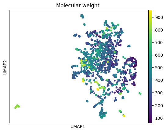
We train a model to predict log-P (a measure of lipophilicity, namely the octanol-water partition coefficient) from the chemical structures.
In practical situations, we could load a pre-trained model as well (example).
from sklearn.ensemble import RandomForestRegressor
from sklearn.model_selection import train_test_split
from sklearn.metrics import root_mean_squared_error

in_smiles = list(anndata_all.obs['SMILES'])
in_signal = list(anndata_all.obs['Log P'])

y_data = np.array(in_signal)
X_data = anndata_all.X

X_train, X_test, y_train, y_test = train_test_split(X_data, y_data, test_size=0.2, random_state=42)

model = RandomForestRegressor()
model.fit(X_train, y_train)

y_pred = model.predict(X_test)
accuracy = root_mean_squared_error(y_test, y_pred)
print(f"RMSE: {accuracy}")
RMSE: 1.0612985649577713Now that we have a model, we can make predictions on the data. For display purposes, we will predict on all the data, including the training data.
import scipy.stats
import matplotlib.colors, matplotlib.pyplot as plt, base64

tree_preds = []
for tree in range(model.n_estimators):
    tree_preds.append(model.estimators_[tree].predict(X_data))
tree_preds = np.array(tree_preds)

anndata_all.obs["predictions"] = tree_preds.mean(axis=0)     # == model.predict(X_data)
anndata_all.obs["uncertainty"] = tree_preds.std(axis=0)
anndata_all.obs["q_predictions"] = scipy.stats.rankdata(anndata_all.obs["predictions"])/len(anndata_all.obs["predictions"])

# adta_all_mod.obs["q_predictions"] is between 0 and 1.
# Replace each of these numerical values by corresponding hex viridis colors.

anndata_all.obs["colormapped_predictions"] = anndata_all.obs["q_predictions"].apply(lambda x: matplotlib.colors.rgb2hex(plt.cm.viridis(x)))There is a very simple conceptual way to calculate the importance of any atom to a prediction: if we remove the atom from the molecule but leave it otherwise equivalent, how much does the prediction change?
This is very efficient to implement using the circular fingerprint features common in cheminformatics. RDKit’s Greg Landrum has some comprehensive explanations on his blog, in addition to the published whitepaper.
def get_pred(fp, pred_function):
    fp = np.array([list(fp)])
    return pred_function(fp)[0]

def render_molecule_scatterplot(
    df, fp_func, smiles_col="SMILES", name_col="Preferred name",
    color_col="color", legend_col="cluster", circ_line_width=0.1, pt_size=5, title='Molecule scatterplot',
    output_html='interactive_scatterplot.html', pred_model=None, size_tuple=(250, 250)
):
    """
    Renders a scatterplot of chemical structures using Bokeh, with points colored according to the 'color' column.

    Parameters:
    df (pd.DataFrame): DataFrame with columns ['SMILES', 'x', 'y', 'name', 'predictions', color_col]
    output_html (str): Filename for the output HTML file

    Returns:
    None
    """
    # Generate images of molecules and encode them as base64
    images = []
    for i in range(len(df[smiles_col])):
        smiles = df[smiles_col][i]
        mol = Chem.MolFromSmiles(smiles)
        if mol is not None:
            img = Draw.MolToImage(mol, size=size_tuple)
            buffered = BytesIO()
            img.save(buffered, format="PNG")
            img_str = base64.b64encode(buffered.getvalue()).decode()

            # Query prediction model to generate "similarity map" of atom contributions
            d = Draw.MolDraw2DCairo(*size_tuple)
            _, maxWeight = SimilarityMaps.GetSimilarityMapForModel(
                mol,
                fp_func,
                lambda x : get_pred(x, pred_model.predict), colorMap='coolwarm',
                draw2d=d
            )
            d.FinishDrawing()
            img_str = base64.b64encode(d.GetDrawingText()).decode()

            img_uri = f'data:image/png;base64,{img_str}'
            images.append(img_uri)
        else:
            images.append(None)

    df['img'] = images
    df['name'] = list(df[name_col])
    df['log_p'] = list(df['Log P'])


    # Prepare data source
    source = bokeh.models.ColumnDataSource(df)

    # Create a Bokeh figure
    p = bokeh.plotting.figure(
        tools='pan,box_zoom,reset,hover',
        title=title,
        width=900,
        height=600
    )

    # Add circle glyphs with color
    if legend_col is not None:
        p.scatter('x', 'y', size=pt_size, line_width=circ_line_width, source=source, fill_alpha=0.6, fill_color=color_col, legend_field=legend_col)
    else:
        p.scatter('x', 'y', size=pt_size, line_width=circ_line_width, source=source, fill_alpha=0.6, fill_color=color_col)
    p.toolbar.logo = None
    # p.background_fill_color = "black"

    # Configure hover tool
    hover = p.select_one(bokeh.models.HoverTool)
    hover.tooltips = """
    <div>
        <div><img src="@img" alt="Molecule image" style="width:300px;height:300px;"></div>
        <div><span style="font-size: 12px;"><b>Name:</b> @name</span></div>
        <div><span style="font-size: 12px;"><b>Prediction:</b> @predictions +/- @uncertainty </span></div>
        <div><span style="font-size: 12px;"><b>Measured log p:</b> @log_p </span></div>
        <br>
    </div>
    """
    if legend_col is not None:
        p.legend.title = legend_col
        p.legend.location = 'center'
        p.legend.background_fill_alpha = 0.5
        p.legend.click_policy="hide"

        # **Set the legend to have two columns**
        p.legend.orientation = 'vertical'
        #p.legend.label_width = 100
        #p.legend.label_height = 20
        #p.legend.glyph_height = 20
        #p.legend.spacing = 5
        p.legend.ncols = 2  # Set number of columns to 2

        p.add_layout(p.legend[0], 'right')

    bokeh.plotting.output_file(output_html)
bokeh.plotting.save(p)Caution: This will generate a large HTML file, as it contains a lot of data, primarily the rendered chemical structures and atomic contribution info for each structure. Budget ~5MB per 100 structures.
This also means it may take a while as it’s not optimized in any way. Budget ~4-10 structures per second.
df_to_visualize = anndata_all.obs[anndata_all.obs['dataset'] == 'FDA'].copy()
#df_to_visualize = df_to_visualize[df_to_visualize['Molecular weight'] > 100]
df_to_visualize| SMILES | Preferred name | Molecular weight | Log P | Rotatable bonds | dataset | x | y | predictions | uncertainty | q_predictions | colormapped_predictions | |
|---|---|---|---|---|---|---|---|---|---|---|---|---|
| ZINC_ID | ||||||||||||
| ZINC000003831551 | C[C@@H](S)C(=O)NCC(=O)O | tiopronin | 163.198 | -0.495 | 3 | FDA | 17.195660 | 9.316160 | -0.44715 | 0.400575 | 0.102477 | #482576 |
| ZINC000000000353 | COc1ccccc1OC[C@H](O)CO | tussin | 198.218 | 0.427 | 5 | FDA | 11.265441 | 13.271760 | 0.75268 | 0.861549 | 0.205882 | #404588 |
| ZINC000003815424 | C#C[C@]1(O)CC[C@H]2[C@@H]3CCc4cc(OC)ccc4[C@H]3... | mestranol | 310.437 | 3.916 | 1 | FDA | 11.851459 | 1.663043 | 3.94839 | 0.640910 | 0.775232 | #6ccd5a |
| ZINC000003872994 | CC(=O)N1CCN(c2ccc(OC[C@H]3CO[C@@](Cn4ccnc4)(c4... | nizoral | 531.440 | 4.206 | 7 | FDA | 19.902925 | 2.564539 | 4.25098 | 0.314860 | 0.846130 | #98d83e |
| ZINC000058581064 | C[C@@H]1CCO[C@H]2Cn3cc(C(=O)NCc4ccc(F)cc4F)c(=... | dolutegravir | 419.384 | 1.353 | 3 | FDA | 9.501749 | 9.927296 | 2.27237 | 1.374526 | 0.427245 | #277f8e |
| ... | ... | ... | ... | ... | ... | ... | ... | ... | ... | ... | ... | ... |
| ZINC000261527196 | CCN(CC)CCS(=O)(=O)[C@@H]1CCN2C(=O)c3coc(n3)CC(... | ZINC261527196 | 690.860 | 2.269 | 7 | FDA | 11.554346 | 4.374998 | 2.47699 | 0.784360 | 0.473065 | #238a8d |
| ZINC000019364219 | CC[C@@H](CO)NCCN[C@@H](CC)CO | ethambutol | 204.314 | -0.293 | 9 | FDA | 18.646709 | 4.687692 | -0.18375 | 1.227059 | 0.123220 | #472c7a |
| ZINC000169621231 | CO[C@H]1C[C@H]2CC[C@H](C)[C@](O)(O2)C(=O)C(=O)... | ZINC169621231 | 958.240 | 6.197 | 9 | FDA | 11.308183 | 3.421286 | 6.11956 | 0.448229 | 0.974613 | #efe51c |
| ZINC000014210455 | CC(C)(C)NC(=O)N[C@H](C(=O)N1C[C@H]2[C@@H]([C@H... | victrelis | 519.687 | 1.711 | 8 | FDA | 15.590030 | 7.315389 | 1.11004 | 1.945198 | 0.249226 | #3b518b |
| ZINC000253387843 | C[C@@H]1OC(=O)C[C@H](O)C[C@H](O)CC[C@@H](O)[C@... | ZINC253387843 | 924.091 | 0.712 | 3 | FDA | 16.625271 | -1.953518 | 0.73869 | 0.660866 | 0.204954 | #404588 |
1615 rows × 12 columns
render_molecule_scatterplot(
    df_to_visualize, fp_func,
    smiles_col="SMILES",
    name_col="Preferred name",
    color_col="colormapped_predictions",
    pred_model=model,
    pt_size=10,
    output_html=f'../../files/dataviz/FDA_scatter_logp_heavy.html',
    legend_col=None,
    title=f'Log-p predictions on FDA-approved drugs (MW > 500)',
    size_tuple=(250, 250)
)
The resulting file readily displays in any browser, and can be shared with collaborators or viewed offline. It shows atomic importances for each structure in determining the log-P prediction. These sanity-check nicely: the lipophilic portions of the molecules are highlighted in red as contributing positively towards higher log-P. Conversely, the hydrophilic portions are in blue, as those atoms contribute negatively towards log-P.
Here is how it looks inline.
@online{balsubramani,
  author = {Balsubramani, Akshay},
  title = {Lightweight, Interactive {QSAR} Importance Plots},
  langid = {en}
}